Special Reports
Color Rush
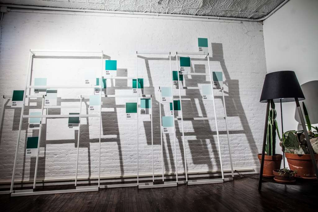
Memorable hues create brand identity

Advertisement
7 design trends to drive customer behavior in 2024
In-store marketing and design trends to watch in 2024 (+how to execute them!). Learn More.


Headlines5 hours ago
Little Caesars to Add 30-plus Restaurants

Headlines10 hours ago
Deadline Extended: Retail Renovation Competition

Press Release11 hours ago
Register Now for Shop! MasterClass: “Re-Sparkling” Retail with Ian Johnston


Bulletins
Get the most important news and business ideas from VMSD magazine's news bulletins.
-
 Photo Gallery2 days ago
The 2024 Shop! Design Awards Winners
-
 Headlines1 week ago
New-Look JC Penney Debuts in New Jersey
-

 Headlines2 weeks ago
Lego Stores in U.S., Canada to Be “Sensory Inclusive”
-
 Sector Spotlight2 weeks ago
It’s a Mall World After all
-
 Headlines1 week ago
Meijer Adding Three Supercenters
-

 Headlines3 days ago
Long Island Shopping Center Sold for $8M
-
 Headlines1 week ago
Uniqlo Expanding Into Texas and in California
-

 Designer Dozen1 week ago
2024 Designer Dozen: Evan Harkrider