When Levi’s opened the doors of its new San Francisco flagship store in 1999, it was one of the company’s first efforts in updating its store environment in almost a decade.
During the years that followed, Levi’s remained committed to evolving its design concept to keep it current with each year’s application. After refinements were tested at Levi’s London store, it was time to return home and use those lessons to make its 24,000-square-foot West Coast flagship the ultimate expression of the brand.
“Levi’s is focusing its store design aesthetic to balance its heritage and modernity,” says Jan Croatt, director of store planning and visual merchandising for the Levi’s Brand Marketing division of Levi Strauss.
While the original character of the flagship was that of a museum-like experience, the redesigned store would be a showcase for the product assortment with a better balance between product display and store layout. The renovation also would give the jeans pioneer the chance to resolve some store design issues that had surfaced over time in the Union Square space. Those included the need for clearer sightlines and a more prominent exterior presence.
Finally, an updated store would also support Levi’s efforts to improve its image, especially with younger shoppers, whom the jeans maker has been courting in recent years to help boost its sales. Levi’s has experienced six years of steadily declining sales since its peak in 1996. Full-year 2002 sales were down 3.5 percent from the year before and 42 percent below the 1996 high. When sales increased by 3 percent in the third quarter of last year, it was the company’s first quarterly sales increase in six years.
Design firm Checkland Kindleysides (Leicester, U.K.), who worked with Levi’s on the original San Francisco flagship, returned to help refine it into a space that reflected both the heritage of the brand (which celebrates its 150th anniversary this year) and its modernity.
Advertisement
“The design challenge was to acknowledge Levi’s as the creator of the original pair of jeans, but at the same time take that inventive spirit forward to the future,” says Jeff Kindleysides, principal at Checkland Kindleysides.
To start, Levi’s wanted to redesign its denim wall presentation. Like most jeans displays, Levi’s arrangement was based on a cubby system compartmentalized according to waist size and finish in boxes across a back wall. “We wanted to go back and really reconsider how best to present denim,” explains Paul Loux, at the time associate director of store design for Levi’s.
Kindleysides explains that designers found inspiration from the way that fresh food is presented – specifically, how the characteristics of certain items, such as pasta or bread, dictate their presentation. This led designers to a new approach for the denim wall featuring a gate system that allows jeans to hang outward on bars, half-folded in stacks of six per peg. “It’s very easy for people to tuck their arm in, pick up three pair and slide out their fit,” says Loux (who has since moved on to Nike as retail creative director). “When they put their arm down, it’s all still intact.”
Customers also can open the gates to find shelves stocked with additional sizes and styles. Both the gated peg and shelf systems are designed to entice customer interaction with the product. The redesigned system also allowed Levi’s to increase its merchandise density on the floor without cluttering the modern and refined environment.
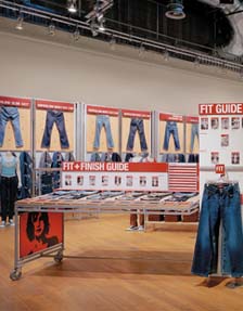


 Photo Gallery3 days ago
 Headlines1 week ago
 Sector Spotlight2 weeks ago
 Headlines1 week ago
 Headlines4 days ago
 Headlines2 weeks ago
 Designer Dozen1 week ago
 Headlines2 days ago