Problem: When Paul Stuart moved from a 23,000-square-foot sprawl to a narrow townhouse, the fashion retailer had to confront the question, “Where will all the merchandise go?”
Solution: A perimeter panel fixture system does the heavy lifting, allowing freestanding tables to preserve the retailer’s minimalist look.
There were several logistical and timing challenges facing Paul Stuart when it scrambled to find a new Chicago location after its Michigan Avenue lease ran out last summer. But once it had settled on a townhouse location on stylish Oak Street, just around the corner from its old location, its biggest challenge loomed: It was moving from 23,000 square feet that flowed across two levels to 6500 square feet in a vertical space just 20 feet wide. So how do you cram all the merchandise into your store when “sleek and uncluttered” is your design vocabulary?
“A lot of work and planning went into making the space what a Paul Stuart shop should be,” says Westchester, Ill., designer Charles Sparks. “We had to begin thinking of a boutique concept, editing the merchandising and trimming down the fixture program.”
Sparks’ firm came up with an open floor plan, with clear sightlines and pathways. Though some of the architectural columns in the 19th Century building are interspersed throughout, there are no interior walls, dividers or wings to otherwise chop up the openness.
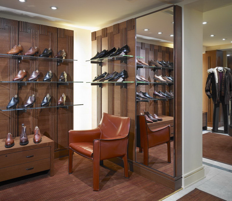
Folded items, like ties, sweaters and pants, are displayed on tables in the middle of the floor, while a system of perimeter millwork panels, modeled after a woven fabric pattern that’s part of the Paul Stuart branding, was designed to showcase suits, sport jackets and shirts. The custom-made millwork (by Bernhard Woodwork, Northbrook, Ill.) features a shifted fluting, an alternating stripe-and-solid pattern that runs down the vertical planes of the cabinetry. Structural columns are clad in the same millwork.
Advertisement
Sparks chose the open panel perimeter system, rather than built-in niche cabinetry, to allow for more hanging items to be exposed. “The retailer didn’t want a lot of hidden merchandise,” he says. And shelves can be affixed to the panels to support folded shirts, accessories and shoes. The trim millwork sits flush against the wall so it appears to widen the selling floor.
Though Paul Stuart didn’t set out to build a green store, Sparks is proud of the way fixtures from the old building – as well as furniture and rugs – were reused.
Freestanding fixtures from the old store were renewed with an oil-rubbed dark bronze metalwork finish and others were wrapped in leather, to match the leather furniture in the store. An antique, round wooden table from the Hancock building was taken out of storage and now sits on a Missoni area rug (also trimmed in leather) in the middle of the shop.
Paul Stuart uses the word “timeless” to describe its elegant merchandise, implying that men of any era would value the styling and quality. Its new home in an old building on a fancy sidestreet in downtown Chicago conveys the same timeless message. The spare panels and freestanding tables that display merchandise are elegant. And it all works in a space about one-fourth the size.
Check out VMSD’s July issue for full coverage of Paul Stuart’s new Chicago store.


 Headlines6 days ago
 Headlines2 weeks ago
 Headlines1 week ago
 Headlines2 weeks ago
 John Ryan2 weeks ago
 Sector Spotlight1 week ago
 Headlines2 weeks ago
 NEXT UX2 weeks ago