Special Reports
Web Exclusive: Color Round-Up
Tickled Pink: This specific color trend permeates retail spaces and lives on through the influencer lens
Pink rippled onto the interior design scene in 2016 and has secured a foothold ever since. Once thought of as frivolous and firmly belonging in 18th century interiors, the color pink has re-established itself as a neutral one that effortlessly sits alongside white, wood, stone and gray, as well as a standout all-over color in its own right. A shade that appears in natural settings, from flower beds to sunsets, it’s soft and warm, especially in shades that bring depth: blush, candy or dusty rose.
The color’s proliferation on Instagram has earned it the title “millennial pink” and serves as proof that it’s a respectable, even covetable, choice for high-profile interiors, like the endlessly photographed Sketch in London. Pink represents beauty without being saccharine and provides a decadent backdrop for experiential shopping and dining.
The color is still having its moment, recently popping up in three spaces we found across the globe, from elegant Del Mar, Calif., to trend-conscious London.

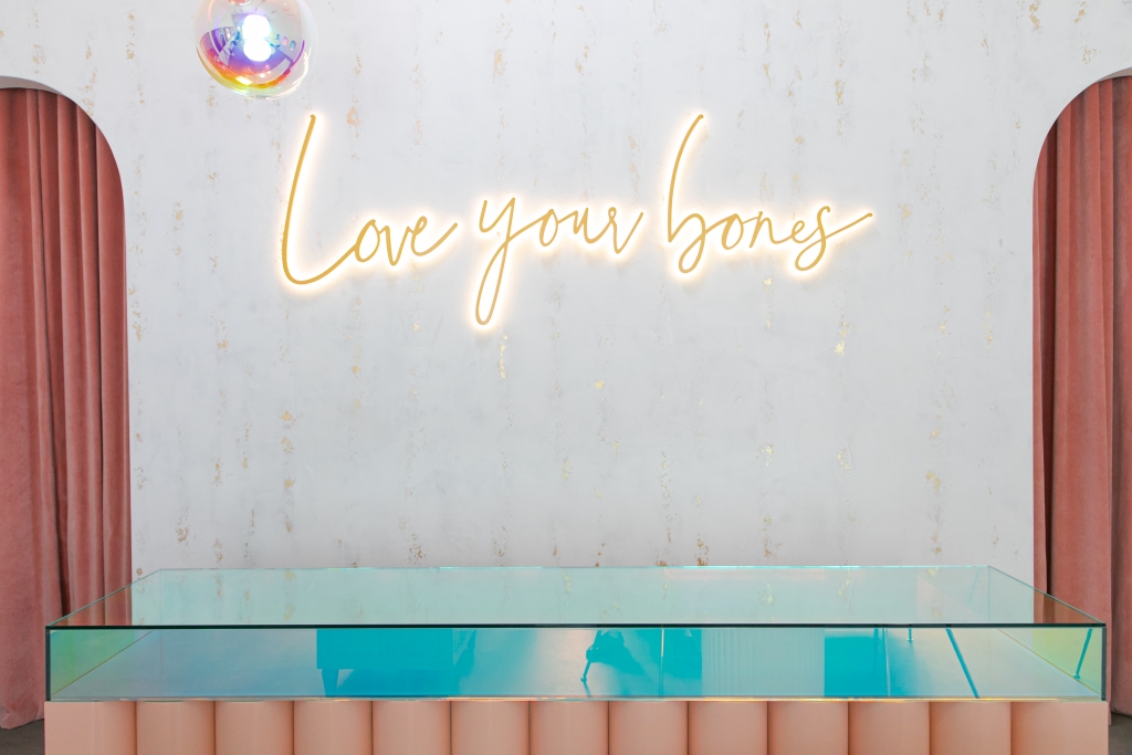
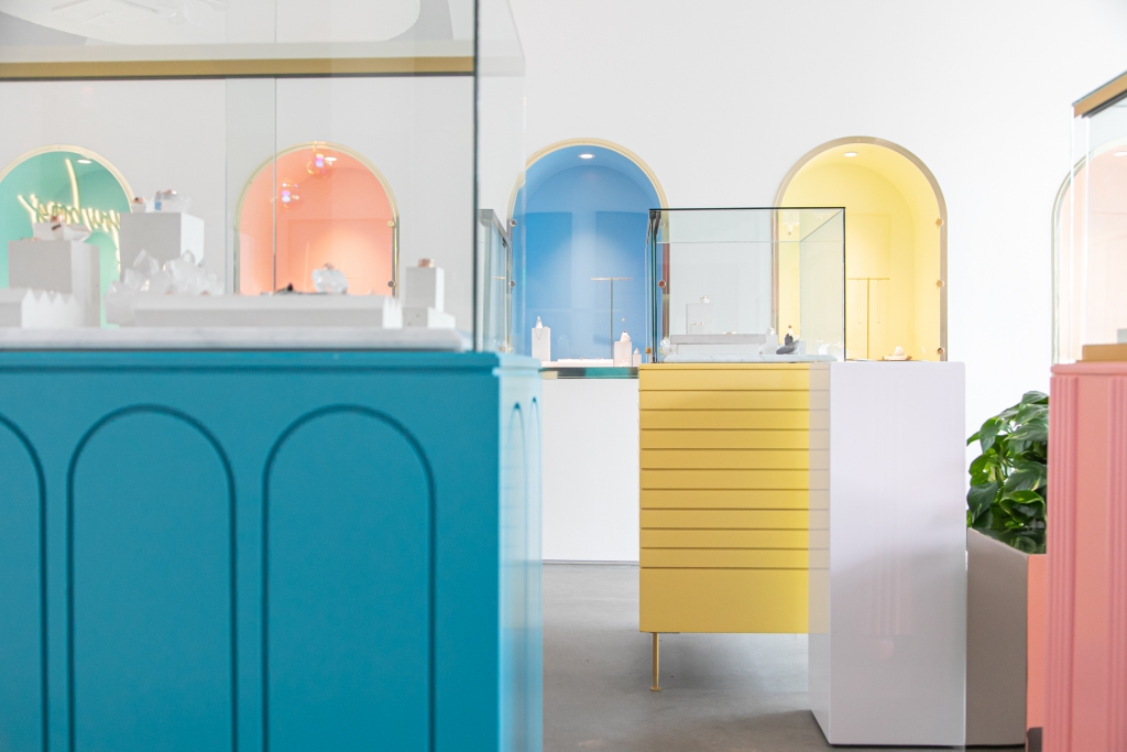
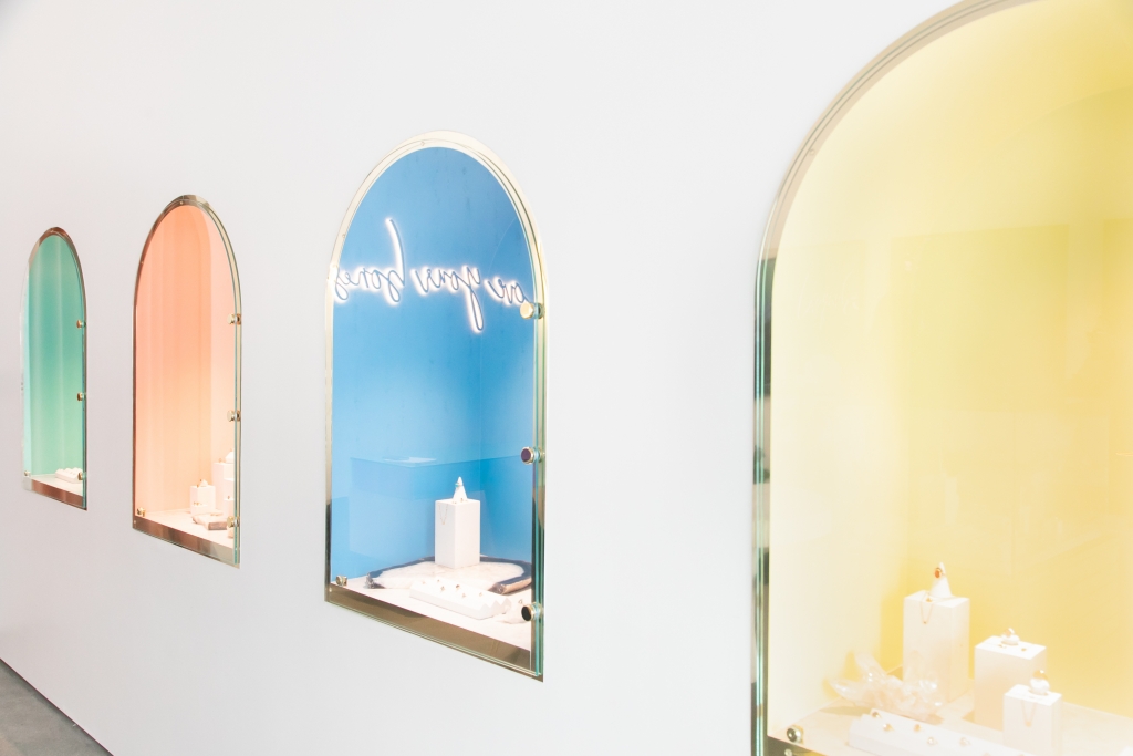
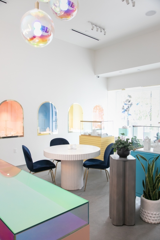
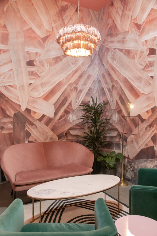
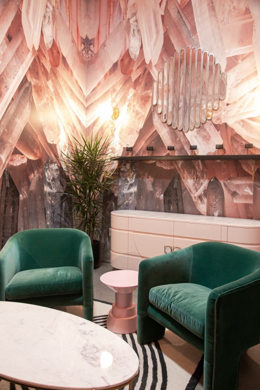
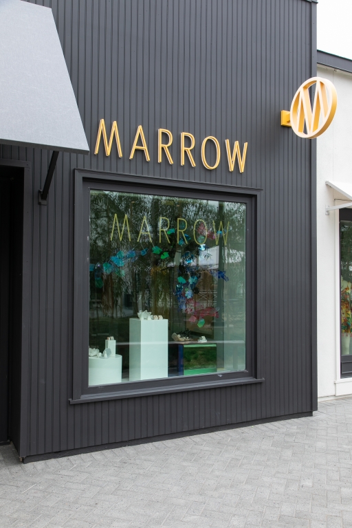
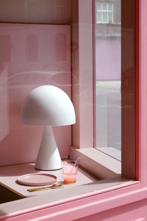
Marrow | Photography: Lily Glass, Los Angeles
La Vie En Rose
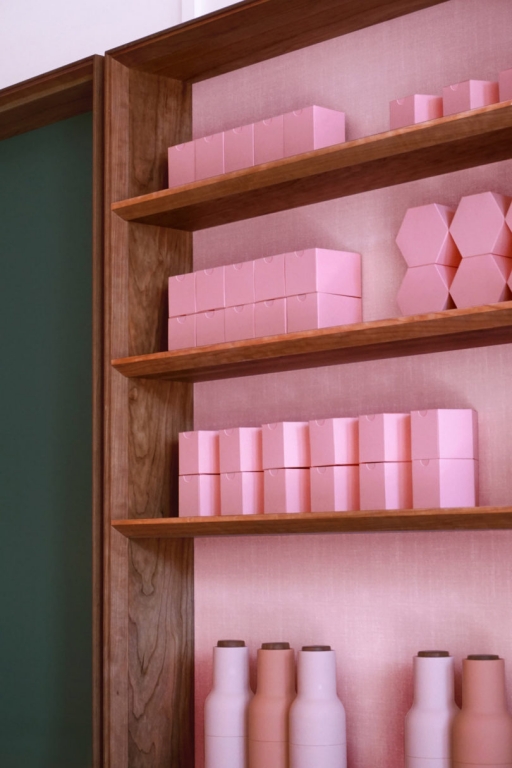
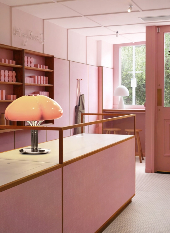
For jewelry brand Marrow (Solana Beach, Calif.), pink was the obvious choice for its recent Del Mar flagship. With a brief that outlined a “romantic, gypsy-luxe sanctuary” and a fine product line to highlight, design firm Bells + Whistles (Los Angeles) set about creating an opulent space.
AdvertisementThe first brick-and-mortar store for the online brand, it was destined to be a “glam rebel retreat.” An accent wall covered with a graphic of pink crystals forms a backdrop for plush velvet loveseats and lush botanicals. Gem-colored tones appear throughout, from rich emerald to sapphire blue.
“Eclectic displays and recessed arched cases pop with a rainbow palette of pastels, complemented by a 7-foot dichroic glass display case perched atop a sherbet-colored femme brutalist base,” explains Barbara Rourke, Co-Founder and Creative Director, Bells + Whistles.
The store delivers an informal, totally immersive shopping experience. Pink is used in a spectrum of shades that convey lavishness and luxury, embodying the brand’s mantra that “more is more.”

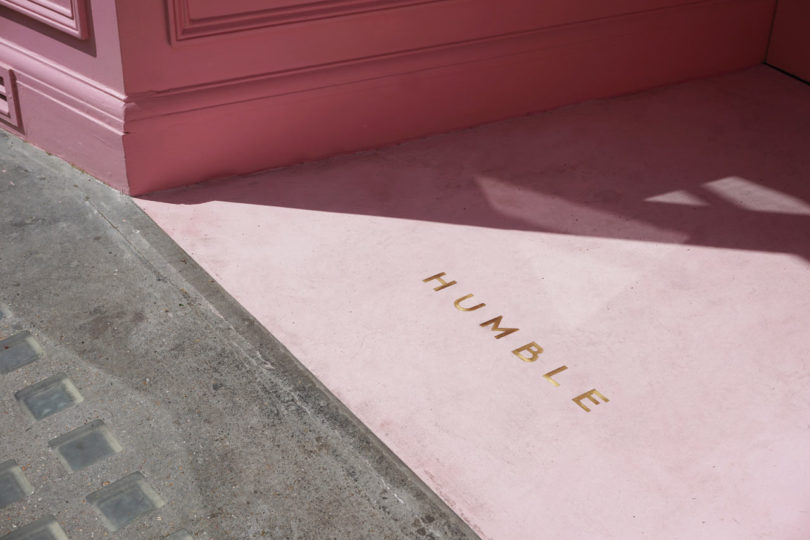
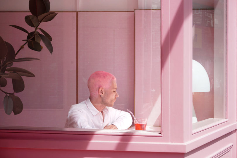
Humble | Photography: Courtesy of Child Studio, London
From Not-so-Humble Origins
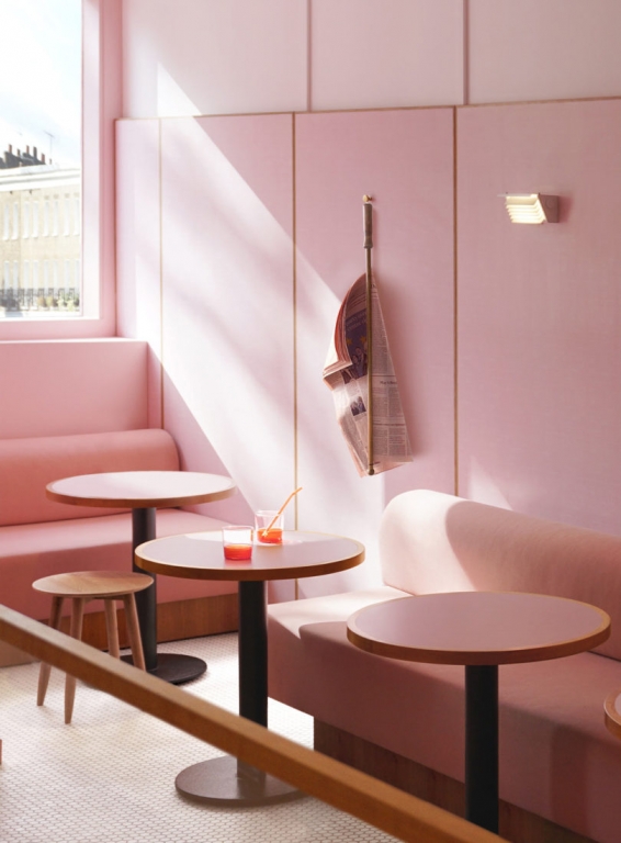
For plant-based pizza restaurant Humble in London’s Chelsea area, the design team looked to the past to inspire their approach. Che Huang, Founder of design firm Child Studio (London) explains, “We started thinking about the ‘golden era’ of King’s Road and its relation to the origins of cafe culture in London. The pastel tones of those modernist, Formica-clad interiors feel so poetic. We decided to imagine a contemporary interpretation of this uniquely London typology.”
AdvertisementA throwback to Chelsea’s mid-century cafes, Humble is candy pink from wall to wall. It’s a striking space, clad with Formica and accented with cherry wood, neon signage and retro lighting, capturing the bohemian vibe that characterized the era of Vivienne Westwood and New Romantics.
Evocative of a Wes Anderson film set, Humble features an open kitchen counter as a focal point for a behind-the-scenes glance at the preparation of plant-based ingredients. “We are drawn to the idea of creating cinematic experiences – immersive environments that invite people to step into a unique atmosphere and lose themselves in a fleeting moment,” Che reveals.
Capturing the attention of social media influencers was another undeniable element of the brief. “Strong concept is always based on an interesting narrative. Whether it is a restaurant, a hotel or a domestic interior – a compelling story is at the core of the experience, ensuring not only the initial ‘buzz’ but also the longevity, as it creates a deeper connection with people,” he says. An unmissable presence on an iconic street in London, Humble is certainly Instagrammable.
.jpg)
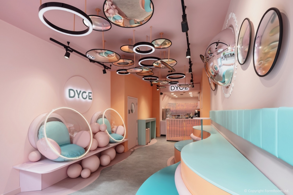
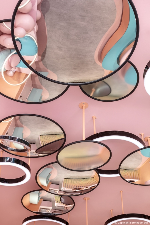
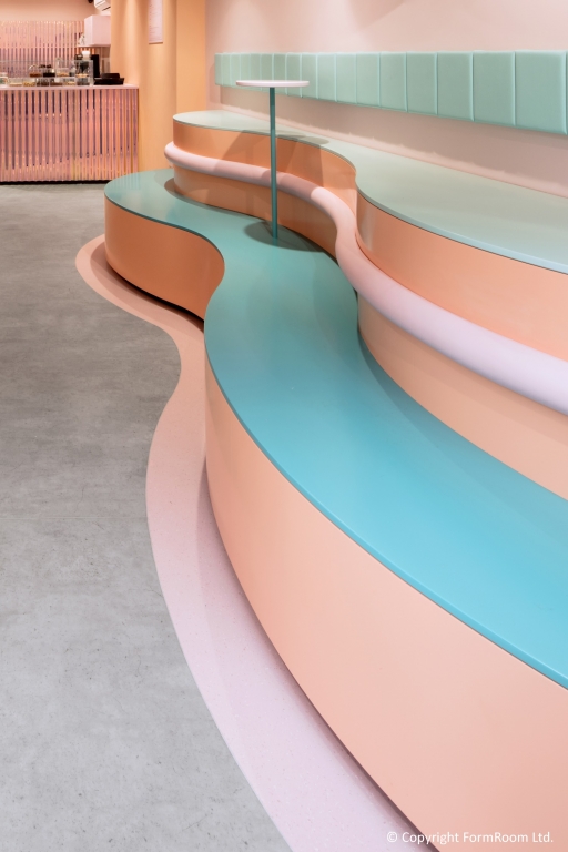
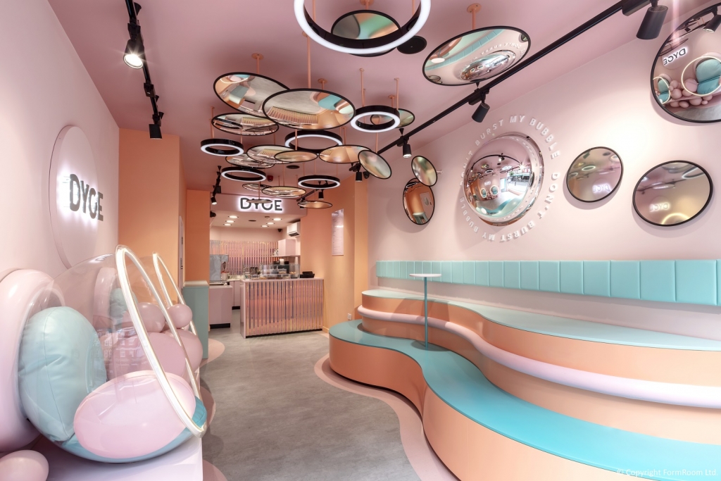
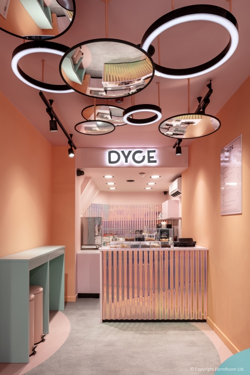
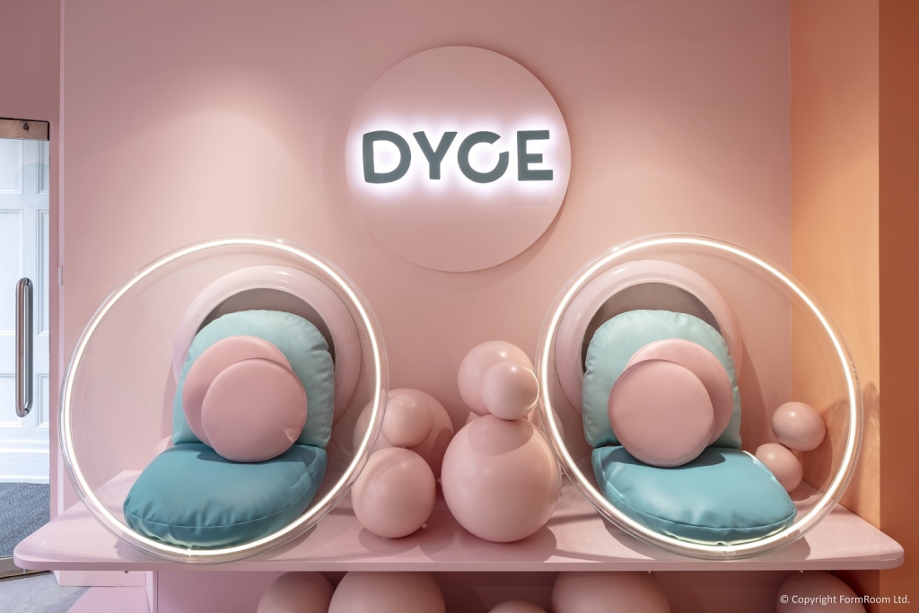
Dyce | Photography: Marcus Peel, London
Pretty in Pink
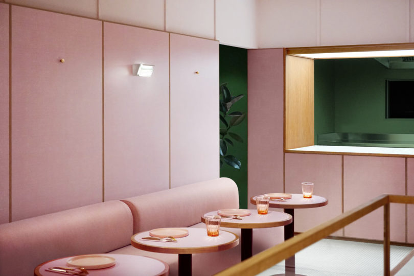
A child-like escape in surroundings that reflect the desserts on offer, Dyce (Marylebone, U.K.) is pretty in pink, with cocoon chairs and wavy accent walls outlined in turquoise. It’s clear that this design was realized with Instagram in mind.
Advertisement“The space illustrates a conceptual take on the dessert ingredients, including melting ice cream and bubble tea,” explains Tala Ali, project lead at design firm Form Room (London). “The color palette expands upon the on-trend 'pink' with unexpected but complementary color contrasts. The bold shapes, textures and pastel-colored interior were applied to ignite customer curiosity while catering to the demand for shareable moments.”
Inspired by Salvador Dali-style surrealism, the space “invites playful interaction in movement for video-sharing platforms” [think TikTok] and makes for an impressive dining destination. Design highlights include “bespoke upholstered cocoon seating, nestled within a field of soft pastel bubbles and the striking ceiling installation – a combination of suspended concave and convex iridescent mirrors, representing bubbles from Dyce’s core product offering.” It’s a perfect example of audience-driven design.
Curating a space for shareable moments is a strong theme across these three concepts, with pink the thread that ties them together. It’s both a nod to the past and a bold statement that it’s a defining color of this era. A trend that’s standing the test of time, it looks like millennial pink is here to stay.


7 design trends to drive customer behavior in 2024
In-store marketing and design trends to watch in 2024 (+how to execute them!). Learn More.


Mango Adding Stores in Washington, D.C., and Boston

Crimes Against US Jewelers Fall Nearly 27% From Record High

Retail Markets in U.S., Canada Remain Tight


Bulletins
Get the most important news and business ideas from VMSD magazine's news bulletins.
-
 Photo Gallery1 week ago
The 2024 Shop! Design Awards Winners
-
 Headlines3 days ago
Target Sued for Biometric Surveillance
-
 Headlines1 week ago
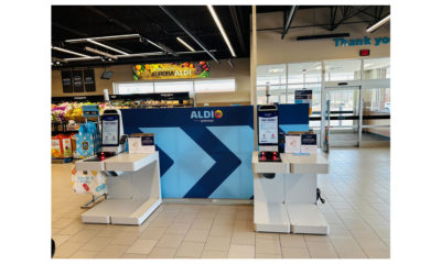
ALDI Launches Checkout-Free Grocery
-

 Headlines1 week ago
Long Island Shopping Center Sold for $8M
-

 Designer Dozen2 weeks ago
2024 Designer Dozen: Evan Harkrider
-
 Headlines1 week ago
Micro Grocery Store Being Built in Tulsa
-

 Designer Dozen7 days ago
2024 Designer Dozen: Lisa Rachielles
-
 Headlines1 week ago
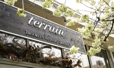
Anthropologie’s Terrain Unit Opens Store at Brooklyn Botanic Garden